
cocoaNEC 2.0 Reference Manual
Output Window
Kok Chen, W7AY
[w7ay (at) arrl (dot) net]
Last updated: June 18, 2012
Output Window
The cocoaNEC Output Window is used to inspect data
that is created by the NEC-2 (nec2c) or NEC-4 compute
engines.
The Output window is automatically opened after the NEC
engine finishes processing a valid input card deck. You can
also manually open the window with the Output
Viewer menu item in the cocoaNEC Window menu.
The graphical information for the Output Window is drawn
from the data in the "line printer" output of the NEC
engine. The original raw output itself can be inspected in
the NEC2 Output view (use the far right tab in the
row of tabs under the window's toolbar).
The other tabs let you select the particular graphical data
that you wish to inspect.
Toolbar and Color
Palette
The top of the Output window includes an integrated
Toolbar/Title bar. There are three tools at the right of
the toolbar: a Printer icon, a Color Wheel and a
gear-shaped tool.
The two colors that are used for plotting the feed point
impedances in Figure 4-2 in the Smith Chart View can be
customized by clicking on the color wheel in the Output
window's toolbar. When you are viewing the Smith Chart, the
Smith Chart's color palette window will appear when you
click on the color wheel. When you are viewing an antenna pattern, the radiation pattern
color palette will appear when you click on the wheel.
Some views in the Output window do not have a color
palette; for those cases, you will hear an alert sound
when you click on the color wheel.
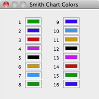
Figure 2-1 Smith Chart
Color Palette
To change the color for a feed
point, click inside the corresponding color well
once. A color well is one of the framed
rectangles, each containing a color value. This will bring
up the Mac OS X Color Picker and you can then use the
various color picker methods to select a new color. Note
that if the antenna has more than 16 feed points, the
colors used in the Smith Chart will repeat.
Because of an idiosyncrasy in Mac OS X, a color well
becomes unselected when you double click on it. Once
unselected, Color Picker changes will not be applied to the
color well. If this happens, simply go back to the color
well to re-click it just once to select it again.
Output options Drawer
The tool that is shaped like a gear is used to open the
Output options drawer.
A Mac OS X drawer is an area of a window that is usually
hidden away and made visible only when you need it. The
Output options drawer will pop out from under the Output
window when you press the gear shaped tool. Pressing it a
second time will again hide the drawer.
Figure 3-1 shows the drawer
extending out from the right side of the Output
window.
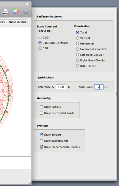
Figure 3-1 Output options
Drawer
Depending on the screen space available behind the Output
Window, Mac OS X can decide to extend the drawer from
either the left side or the right side of the wIndow.
Notice the two output options (Reference Zo and SWR circle
size) that were mentioned earlier. When you change the
values from the cocoaNEC default, they are saved to the
plist when you exit cocoaNEC.
Smith Chart View
Figure 4-1 shows the Smith Chart view of the
Output Window:
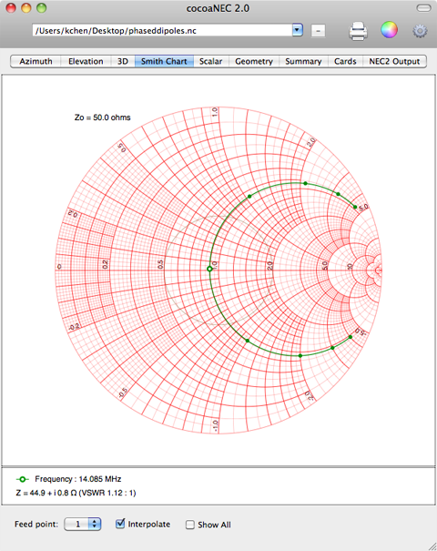
Figure 4-1 Smith
Chart
The green dots in the Smith Chart are the antenna's feed
point impedances. Each dot represents the impedance at a
particular frequency.
The Smith Chart encompasses the entire left half of the
semi-infinite complex impedance plane into a finite disc.
The horizontal line that cuts the Smith Chart into two
halves is the resistance axis. The leftmost point on this
horizontal line represents zero resistance, while the
rightmost point represents infinite resistance. The center
of the circle is the reference impedance. The reference
impedance is an option (see below later) that the user can
select. The caption that is above and to the left of the
chart shows the reference impedance (Zo) that is being
used; in this case, 50 Ω.
Impedances that have the same VSWR lie on the same
concentric circle in a Smith Chart. The center of the Smith
Chart is the impedance that presents a VSWR of 1.0:1. The
light gray circle in Figure 4-1 are points on the Smith
Chart where the VSWR is 2.0:1. The size of the SWR circle
is set in the Output options drawer that
is described later below. cocoaNEC only draws an SWR
circle when its value in the options drawer is greater
than 1.05:1. The reference impedance, Zo can also be set
in the same options drawer.
Points on the Smith Chart that are below the resistance
axis have capacitive reactance and points above the
resistance axis have inductive reactance.
The Smith Chart is therefore a very compact representation
of a feed point impedance, visually displaying the
resistive and reactive parts of an impedance and VSWR
information with just a single point in the chart.
A disadvantage of a Smith Chart representation is that it
contains only the left half of the complex impedance plane.
Negative feed point resistances (which is often encountered
in phased arrays) will fall outside the Smith Chart disc.
For such cases, it might be better to view the feed point
impedance using the Scalar charts instead of a Smith Chart.
Figure 4-1 shows the feed point impedances of an antenna at
nine different frequencies as nine green dots on the Smith
Chart.
The impedance for each frequency is shown as a green dot.
The "selected point" is represented by a green dot that has
a hole in it (donut). The details of that point (its
frequency, impedance and VSWR) are listed under the chart.
Mouse click on any other dot in the Smith Chart to select
and view its details. (If the click misses a dot, you will
hear a beep.)
The nine green dots in Figure 4-1 are interconnected by a
green curve. The locus of this curve is not computed by
NEC-2 but is simply an estimate of the trajectory of the
intermediate impedances by using splines. Unless the green
dots are moderately dense, do not rely on the green curve
to accurately represent the impedance values between the
green dots. The Interpolate checkbox at the bottom
of the Smith Chart view lets you choose whether to display
the interconnecting curve. The drawing of this curve is
also automatically suppressed when there are fewer than 4
data points.
When the antenna model has more than one feed point, the
Feedpoint popup menu at the bottom left of the
window lets you to choose which feed point to display
inside the Smith Chart. You can also show all feed points
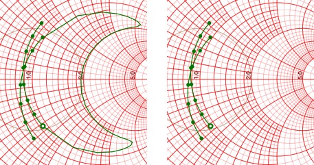
at the same time. The following figure shows the output
from a phased dipole with two feed points, when the
Show All checkbox is selected.
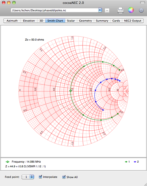
Figure 4-2 Smith Chart
with two feed points
If the "Smart Interpolation" checkbox at the
bottom of the Smith Chart View is selected, cocoaNEC
will not draw an interpolated curve in between disjoint
frequency bands of a multi-band antenna. The following
shows the Smith Chart View of the W1ZR 2-band sleeve
dipole drawn with Smart Interpolation off (left) and
Smart Interpolation on (right):
Scalar Charts
The scalar charts provide an alternate way of visualizing
the feed point impedances of an antenna. Figure 5-1 shows
the scalar plot displaying the impedance (R-X) plot.
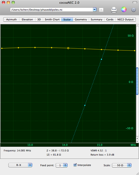
Figure 5-1 Impedance
(scalar) plot
The horizontal axis of a scalar plot is the frequency
scale. In the case of an impedance plot, the vertical axis
is an impedance value (in ohms). The real (resistive) part
of the impedance is plotted with yellow dots and the
imaginary (reactive) part of the impedance appears in cyan.
Like the Smith Chart, if there are 4 or more points, and if
the Interpolate checkbox is selected, a curve will
be drawn through the actual impedance points that are
computed by the NEC engine. The imaginary curve uses a
dashed line to join the points.
Also like the SmithChart case, you can choose which feed
point of a multiple feed point model to plot. To avoid very
confusing plots, only one feed point can be displayed at
any one time.
For the Impedance plot, you can only click on the real part
(yellow dots) to select a point for which to extract
detailed data. This data is shown under the scalar chart
and include the frequency of the computed point, its
complex impedance, the magnitude of the impedance, the VSWR
and the return loss.
In addition, you will find a Scale menu at the bottom right
of the window. Together with the scroll knob of the scalar
plot, this gives you finer control of what you would like
to view. Figure 5-2 shows the same plot, with the Scale
menu changed to view a larger impedance range:
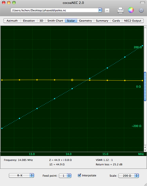
Figure 5-2 Impedance
(scalar) plot with a different vertical scale
You can also see a taller plot by resizing the window. The
scale inside the plot is a constant number per pixel.
The menu at the bottom right of the window lets you select
other scalar views to display. Figure 5-3 shows the
magnitude of the impedance for the same antenna.
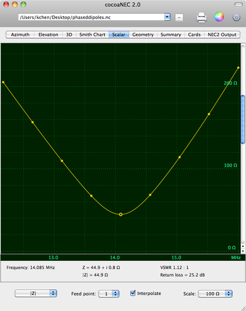
Figure 5-3 |Z|
plot
Figure 5-4 shows the VSWR of
the same antenna.
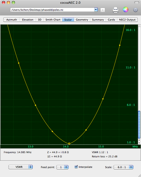
Figure 5-4 VSWR
plot
2D Antenna Patterns
The Elevation tab button in the Output Window
takes you to the far field elevation radiation pattern of
the antenna.
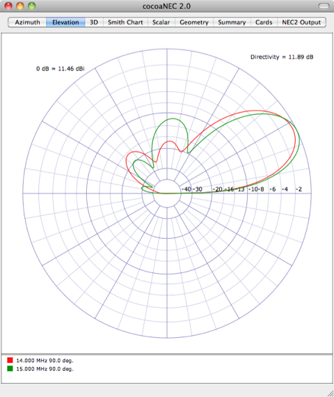
Figure 6-1 Elevation
Pattern
The reference gain for the
outer circle ("0 dB" circle) is shown on the top left of
the plot as decibels referenced to an isotropic antenna
(dBi). The relative gains (in dB) for the inner circles are
labeled along the horizontal axis of the chart. Note that
the toolbar is hidden in Figure 6-1 (by clicking on the
translucent button at the topmost right corner of the
Output Window).
The directivity of the antenna is shown
above and to the right of the antenna pattern. A
lossless antenna will have the same directivity (in dB)
as the maximum isotropic gain (in dBi). When the gain
value (in dBi) is different from the directivity (in
dB), it can be due to losses (including ground losses),
or it can be because the azimuth and elevation angles
chosen for the antenna pattern are not the angles where
the antenna gain peaks.
Notice that the logarithmic scale of the plot in Figure 6-1
places the -10 dB point about halfway out from the center.
This represent a scale factor of 0.89 per 2 dB, and is the
standard which is used in ARRL publications. There are two
other scale factors that you can choose in the options drawer. Figure 6-2 shows the
same antenna as Figure 6-1, but plotted using the scale
factor of 0.80 per 2 dB.
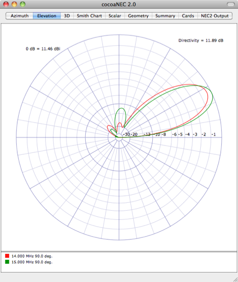
Figure 6-2 Elevation
Pattern plotted at a scale of 0.80 per 2 dB
Instead of expanding the outer radii, can also expand the
inner radii by choosing a scale factor of 0.92 per 2 dB in
the options drawer.
The patterns in Figures 6-1 and 6-2 each shows two antenna
patterns. This is because NEC-2 was asked to model the
antenna at two different frequencies. The color captions
under the antenna patterns show the red curve is the
elevation pattern for 14 MHz, computed at an azimuth angle
of 90 degrees, and the green curve is the elevation pattern
for 15 MHz, taken at the same azimuth angle.
When you specify multiple elevation angles in addition to
multiple frequencies, you will see yet more plots, as seen
in Figure 6-3.
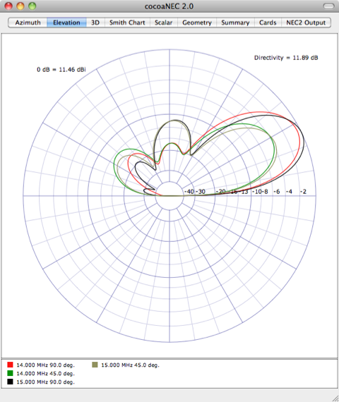
Figure 6-3 Elevation
pattern with multiple frequencies and multiple azimuth
angles
The Azimuth tab button in the Output Window takes
you to the far field azimuth radiation pattern of the
antenna. In the case of the Azimuth pattern, the color
captions under the patterns will show the azimuth angle of
the corresponding pattern. Figure 6-4 shows the Azimuth
plot at two frequencies and two different elevation
("take-off") angles:
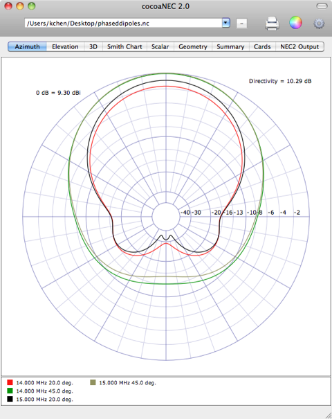
Figure 6-4 Azimuth
plots
As in the Smith Chart plots, the colors used in the Azimuth
and Elevation antenna patterns are user customizable. The
antenna patterns (including the antenna patterns in the
Summary view discussed further below)
share a color palette, but is distinct from the color
palette used for the Smith Chart.
Reference Plots
The Output Window discards the data from a previous run
when you rerun a model through NEC.
However, when you run more than one model during a cocoaNEC
session, the data from each model is saved into a different
context. You can quickly switch between the data
from the different contexts by using the popup menu that is
in toolbar of the Output window:
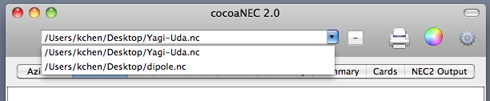
Figure 7-1 Context
selection
When you no longer need a context, select it as the current
context and use the minus button on the right of
the menu to remove it.
NEC-2 and NEC-4 runs from the same model will create
different contexts. You can therefore compare NEC-2 outputs
with NEC-4 outputs. NEC-4 contexts will have a "(NEC-4)"
label in the context name.
Any context can be used as a "reference antenna." To do
that, first select the context and then go to the Output
Menu in the menu bar to select Use As Reference:
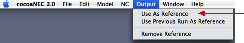
Figure 7-2 Setting a
context as the reference antenna
A black square is shown at the
left of the reference context.
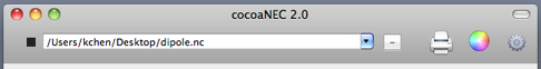
Figure 7-3 Reference
context indication
Figure 7-2 also shows a "Use
Previous Run as Reference" menu item. Instead of using a
different antenna model as the reference, you can use the
most recent run from the same model as the reference. By
selecting "Use Previous Run as Reference," you can observe
your progress when you make changes to a model.
Once you choose a reference antenna, its plot will be
superimposed on the plots of the other antennas. Figure 7-4
shows a reference antenna (a dipole) superimposed as a
black dashed line on top of the plot (red) of a three
element Yagi-Uda array.
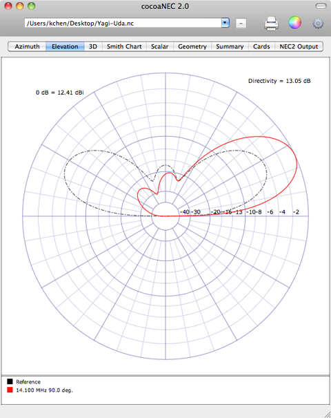
Figure 7-4 Elevation plot
of an antenna and a reference
If the reference antenna produces multiple antenna
patterns, the first pattern is plotted as the reference
pattern.
The Smith Chart draws the feed point of the reference
antenna as a gray disc, shown below:
Figure 7-5 Reference
context in the Smith Chart
If the reference antenna has multiple feed points, the
first feed point is displayed as the reference in the Smith
Chart.
3D Antenna Pattern
The 3D tab button in the Output Window takes you
to the antenna's 3D radiation pattern.
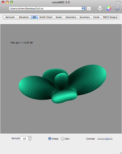
Figure 8-1 3D Radiation
Pattern Shape
The pattern can be rotated in the azimuth by changing the
Azimuth field at the bottom left of the window, or
by using the stepper arrows next to the azimuth field.
If you are using an older computer, the use of the stepper
is not recommended since the drawing can be very slow.
However, any Intel based Macintosh with a good graphics
card should be able step through the azimuth angles quite
fluidly. You can also disable 3D drawing completely on
slower computers by disabling the Enable 3D Radiation
Pattern menu item in the cocoaNEC Options Menu (in the
main menu bar). The state of this menu item is not saved to
the plist.
The Contrast slider on the bottom right of the
window lets you adjust the contrast of the image.
Figure 8-1 is drawn as a "shape" of the gain of the
radiation pattern. The brightness of a surface patch,
shaded using Phong shading, is proportional to the
surface normal of an imaginary light beam in the
direction of the antenna pattern.
Figure 8-2 below is drawn by using the gain of the antenna
pattern itself to control the brightness.
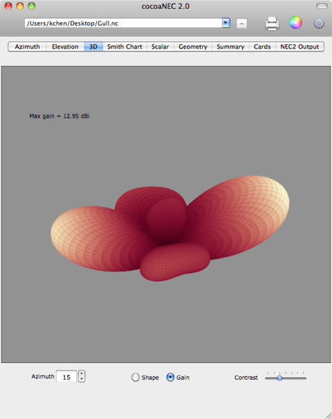
Figure 8-2 3D Radiation
Pattern Gain
In Figure 8-2, the brightness
of a surface patch on the 3D surface is simply how far that
point protrudes from the center of the 3D pattern. Notice
that the sidelobes of the antenna is very dim (low gain)
compared to the sidelobes in Figure 8-1. Figure 8-2
("Gain") is more useful for locating the high gain
directions of the antenna while Figure 8-1 ("shape") is
more useful at showing the 3 dimensional shape of the
radiation pattern.
Output Summary and Average Gain
Test
The Summary tab displays the azimuth plot, elevation plot
and distilled NEC-2 output all in the same view:
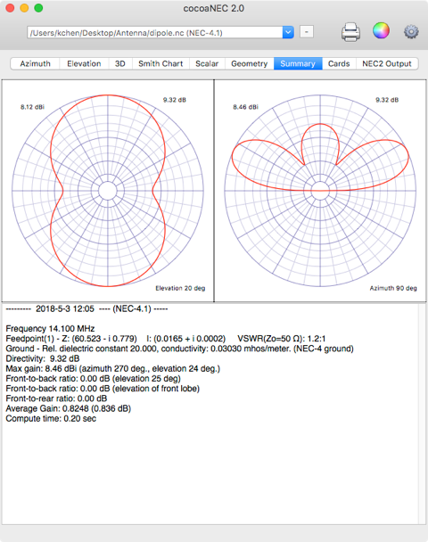
Figure 9-1 Output
Summary
The antenna patterns at the top of the Output Summary are
abbreviated copies of the Azimuth and Elevation plots. As
with the larger originals, the captions at the left of the
circles are the gains for the outer circle, and the
captions on the right of the circles show the directivity
of the antenna. In addition, the elevation angle for
azimuth plot is shown in the azimuth view, while the
azimuth angle doe the elevation plot is shown in the
elevation view.
Other data are shown in the scroll view under the antenna
patterns. Here, you can find the ground used for the model
together with the azimuth and elevation angles for the peak
gain of the antenna. All feed point currents of a phased
array are also listed in the summary.
There are two front-to-back values in the output
summary, together with a front-to-rear number.
The azimuth of antenna lobe with the largest gain is
considered the "front" of the antenna. The "back" of the
antenna is 180 degrees from this azimuth. One of the
front-to-back numbers in the output summary refers
to the response in the "back" direction which has the same
elevation angle as the front lobe.
The second front-to-back number compares the front
lobe to the "largest" value in the back lobe over all
elevation angles. These two front-to-back ratios are not
always the same, with the latter one being more
pessimistic.
The azimuth angles that are more than 90 degrees away from
the "front" lobe is considered by cocoaNEC to be the "rear"
of the antenna. The front-to-rear number is
computed by looking for the largest lobe on the rear of the
antenna. The front-to-rear number can be a useful for
evaluating antennas that have cardiod patterns (very typical of two
element vertical phased arrays) where the front-to-back
ratio can return an infinite number, but obviously not
reflecting the true performance of an antenna in real
world use.
The antenna model's Average Gain is listed in the output
summary. This number can be used to judge if the model of a
lossless antenna has converged (the so called Average
Gain Test or AGT).
Regardless of the directive gain, the average gain of any
lossless antenna should be close to 1.0 (0 dB). This fact
can be used to judge if the NEC model of an antenna has
converged. Although a model's accuracy is not completely
guaranteed, an antenna model that yields an average gain
which is within 0.2 dB of unity can be considered to be
moderately reliable. On the other hand, an antenna model
whose average gain number is more than 1 dB from unity
(i.e, an average gain factor that is smaller than 0.8 or
greater than 1.25) is almost certain to be a poor model of
a real antenna.
The Average Gain Test number in cocoaNEC is not useful when
modeling an antenna that is over lossy grounds, or when
modeling antennas with lossy elements. To make use the
Average Gain Test, you should model the antenna over a
Perfect Ground or in Free Space.
Polarization of Antenna
Patterns
In addition to total power gain, the NEC output also
provides power gains for horizontal and vertical
polarizations. cocoaNEC computes the left hand and right
hand circular polarization responses from the axial ratio
and predominant polarization values.
When cocoaNEC is launched, its output window defaults to
plotting total power.
You can select which polarization to plot either by
selecting one of the Polarization radio buttons in
the Options drawer (see Figure 3-1) or by selecting one of
the Radiation Pattern Polarization menu items in
the Output menu in the menu bar.
You can draw both Horizontal and Vertical polarization
responses on the same plot by choosing
"Horizontal+Vertical." Likewise, both RHCP and LHCP
responses can be drawn on the same plot. The figure below
shows the Output Summary azimuth and elevation
patterns for a quadrature fed Inverted Vee Turnstile
antenna when "RHCP+LHCP" is selected:
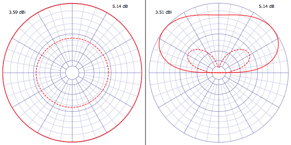
Figure 10-1 Composite RHCP
pattern (solid line) and LHCP pattern (dashed line) in the
Output Summary
The solid line is the RHCP
pattern and the dashed line is the LHCP pattern. When
horizontal and vertical polarizations are combined, the
horizontal polarization pattern is drawn with a solid line
and the vertical polarization pattern is drawn with a
dashed line.
Please note that you need not rerun the antenna model when
you change polarization. This is an output post processing
task.
The Polarization selection also affects 3D plots. Figure
10-2 shows the 3D patterns for the same antenna that is
shown in Figure 8-1. The left side of Figure 10-2 is the
pattern for horizontal polarization and the right side is
the pattern for vertical polarization.
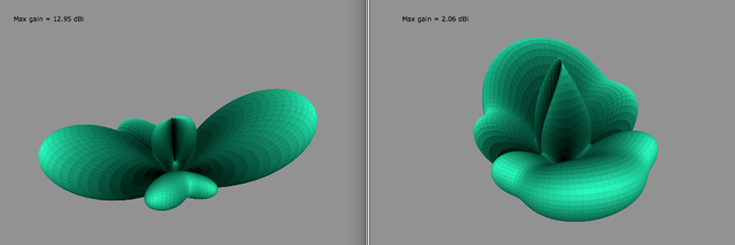
Figure 10-2 3D Horizontal
Polarization (left) and Vertical Polarization
(right)
Geometry and Currents
The Geometry tab takes you to the panel that shows the
geometry of wire antennas. cocoaNEC may not draw geometries
such as arcs, helices and surface patches that are created
by the NEC card deck. Complex wire shapes that are
programmatically generated by NC should draw correctly.
Figure 11-1 shows what a six element Yagi-Uda looks like in
the Geometry view.
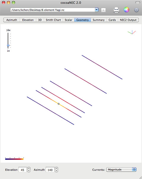
Figure 11-1 - Antenna
Geometry and Currents
The two fields at the bottom left of the window control the
viewing angle relative to the centroid of the antenna. An
elevation angle of 0 places the eye at the same height as
the centroid. An elevation angle of 90 degrees corresponds
to placing the eye straight above the centroid and looking
back at the antenna from the +z axis. An elevation angle of
-90 degrees corresponds to placing the eye below the
centroid and looking up at the antenna from the -z axis.
A triad of unit vectors appear at the top right hand corner
of the view. The red, green and blue (RGB) colors
correspond to the x, y and z directions, respectively.
An azimuth angle of 0 corresponds to placing the eye on the
+x axis and looking back at the antenna. An azimuth angle
of 90 degrees corresponds to placing the eye on the +y
axis.
You can set the angle by either typing directly into the
text fields, or by using the up and down arrow steppers.
The buttons autorepeat, so you can hold down the button and
see an animation of the model. The elevation angle has hard
stops at -90 degrees and +90 degrees. The azimuth angle
wraps around the circle, with 360 degrees wrapping back to
0.
When you control click (or right
mouse click) on the Geometry view, a green dot is drawn
at the wire segment that is closest to the cursor. This
is shown in the figure below:
Information for the selected segment is shown at the bottom
right corner of the Geometry view. The first row has the x,
y and z coordinates of the center of the segment. The
second line of text has the vector current, and the third
line shows the current magnitude and phase angle.
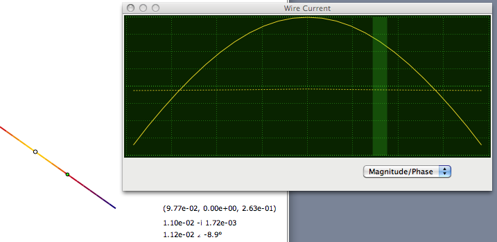
In addition, a smaller Wire Current window is drawn to show
the distribution of currents on the wire of the selected
segment.
You can select either a Magnitude/Phase plot or a
Real/Imaginary plot.
The currents are normalized to the largest current in the
entire geometry. Phase angles are drawn from -180 degrees
(bottom) to +180 degrees (top) in the dashed yellow line as
shown above. A light green bar shows the segment location
within its wire.
Real and imaginary currents are centered to the middle of
the plot, with negative currents below the center line and
positive currents above the center line.
Use shift-control-click (or hold down the shift key with a
right mouse click) anywhere in the view to remove the
information (and green dot).
The Currents menu at the bottom right of the
window can be set to None, Scaled Magnitude, Magnitude,
Magnitude and Phase, and Magnitude and Relative
Phase.
With the Currents menu set to None, antenna
current information is not plotted. When the Currents menu
is set to Magnitude, the colors of the antenna
segments correspond to the magnitudes of the current.
Maximum current appears as a bright yellow and zero current
appears as dark gray. A scale is shown on the bottom left
corner of the view. The Scaled Magnitude
selection is similar to Magnitude selection except the low
current portions are stretched to better see low currents.
When the menu is set to Magnitude and Phase, the
currents appear as colors in the HSV color space. The phase angle of a
current corresponds to the hue of the color, and the
magnitude of a current corresponds to the value of the
HSV color (brighter colors carry larger currents). The
colors that correspond to the various phase angles for
the maximum current are shown in the color wheel on the
bottom left corner of the view.
The slider at the top left of the view magnifies the
structure geometry from the original 1x continuously up to
a scale factor of 16x. You can also "pan" the drawing up
and down and left to right by holding down the mouse in the
view and dragging the cursor while the mouse button is held
down. While the mouse is held down inside the Geometry
view, the cursor turns from an arrow to an open hand.
When the Geometry view is panned, a re-center button will
appear and you can reset the panning action with the
button:
![]()
The following shows the
Magnitude and Phase view of a Half Square antenna
with a reflector (note the scale slider has also been moved
to magnify the image slightly):
Figure 11-2 Currents in
Magnitude and Phase (HSV Color)
The Magnitude and Relative
Phase setting is similar to the Magnitude and
Phase setting except all phase angles are referenced
to the phase of the current in the segment with the largest
current.
Sources and Loads in the Geometry
View
Voltage sources (seen in Figure 11-2) are drawn as open
circles in the Geometry view. Current sources (shown in
Figure 11-1) are drawn with a double circle.
Loads such as impedance and RLC loads are displayed in the
Geometry view as small crosses.
Distributed loads such as wire conductances is only drawn
when the "Draw Distributed Loads" checkbox is selected in
the options drawer.
Radials in the Geometry
View
Both the spreadsheet interface and NC in cocoaNEC have
provisions for adding radial wires. In addition to the
convenience factor, wires that are added with the special
radials mechanism are specially tagged so that their
drawing can be omitted in the Geometry view.
The default state of the Geometry view is to not draw the
radials, but you can force cocoaNEC to draw them by
checking the Draw Radials box in the Options
Drawer (see Figure 3-1). Figure 11-3 shows a
dipole on top of a set of radials with 19 spokes.
Please note that you have to use the radials()
function in NC to view the radials. The function
necRadials() generates radials that are internal to NEC-2
and don't appear as wires in the NEC output.
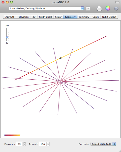
Figure 11-3 Current
distribution in Radials
Notice that the Scaled Magnitude menu is chosen in
the above figure. The currents in the radials for this case
are very low and the slight differences of the currents for
the individual radials would not have shown up if
Magnitude were selected.
Next: Printing
Back to: Reference Manual